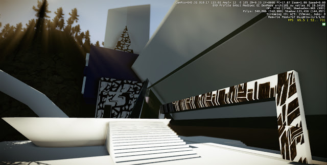
For my Facebook elevator, i chose to design something simple and that directly related to the image of Facebook. hence i used very ordinary squares and a Facebook logo. This way, when a client is traveling on the elevator, the can experience the surrounding landscape without obstructions.
For the coca-cola elevator i decided to use a sphere as a way of complementing the dome in the Headquarters
Additional images
Reference:
the Coca Cola logo was obtained from the Google 3D Warehouse by ŊھĐОĢ


